Introduction:
Have you ever looked at something and found it hard to read? Maybe the letters looked squished, too fancy, or just confusing. Fonts are styles of letters we see every day on websites, books, signs, and even homework. Some fonts are very easy to read, while others can make your eyes feel tired. That’s why choosing the right font really matters, especially if you want people to understand your words quickly.
Fonts play a big part in how we read. Some are perfect for kids, while others work better for grown-ups. Some fonts help you read faster and more easily. Others can slow you down. In this article, we will explore the best and easiest fonts to read. We’ll look at how font shapes, spacing, and size can make a big difference. Let’s learn together and find out which fonts are best for simple and clear reading.
What Font Is The Easiest To Read?
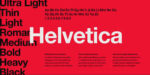
When it comes to easy reading, sans-serif fonts are the top choice. Sans-serif fonts are letters that don’t have small fancy lines, called serifs, on the ends. These fonts look clean and simple. A great example is Arial. Arial is used in schools, websites, and even apps because it is very clear. Another good one is Helvetica. It looks smooth and doesn’t have extra decorations, which makes each letter stand out. Because of this, many people find Helvetica one of the easiest fonts to read.
Another font that is super easy to read is Verdana. It was made especially for computer screens. The letters are wide and the spaces between them are bigger. This makes words easier to read, even on a small phone. Tahoma is another helpful font. It looks like Verdana, but the letters are a bit closer together. Still, it stays simple and easy on the eyes. These fonts help everyone read faster without feeling tired.
Why Font Style Matters for Reading?
Not all fonts are the same. Some fonts look fun, but they are hard to read. Fonts with curly or fancy lines can be confusing. Imagine trying to read a book where every letter looks like a piece of art! That would take a lot more time. Simple fonts are better because they let your eyes move smoothly from word to word. Also, if the letters are spaced out well, it becomes easier to tell them apart.
Many schools and websites choose fonts that help readers stay focused. When a font is too complex, it can distract your brain. Even young readers need fonts that keep reading fun, not frustrating. So, fonts with clean lines and good spacing are best. That’s why simple styles like Arial, Verdana, and Tahoma are so popular in books and learning tools.
Serif vs. Sans-Serif: What’s the Difference?
Let’s talk about serif and sans-serif fonts. Serif fonts have little lines or tails at the end of each letter. They can look a bit fancy. Examples of serif fonts are Times New Roman and Georgia. Some people like these fonts in books or newspapers because they look classic. However, those little lines can be hard to see on screens, especially if the text is small.
On the other hand, sans-serif fonts do not have those extra lines. That’s why they are often used in websites, schoolwork, and mobile apps. These fonts look modern and clean. Many teachers and designers pick sans-serif fonts to help everyone read with less stress. While serif fonts are not bad, sans-serif fonts are usually easier for most readers, especially kids and people with reading difficulties.
Best Fonts for People With Reading Challenges
Some people have trouble reading because of learning differences. One common challenge is dyslexia. This makes letters look jumbled or flipped. But don’t worry—there are fonts that help! One of the best fonts for dyslexia is called OpenDyslexic. It has heavy bottoms on each letter. That helps stop letters from turning or mixing up. People with dyslexia often say this font helps them read faster and better.
Another good font for reading problems is Comic Sans. Yes, it’s fun and playful, but it also works. Comic Sans has clear shapes and wide spaces between letters. It helps your brain understand each word one at a time. While some adults may not like Comic Sans, many teachers use it to help students read better. It’s friendly, and it works!
Fonts That Are Hard To Read:
Now that we’ve talked about easy fonts, let’s look at some that are harder to read. Cursive fonts are a good example. These are the ones where letters connect like handwriting. They can look nice on invitations, but they are not great for learning or reading long texts. Fonts like Brush Script or Lucida Handwriting look cool, but your eyes may get tired quickly.
Also, fonts that try to be funny or super creative—like Jokerman or Chiller—can be hard to understand. Letters may be shaped in strange ways, and spacing is often tight. These fonts are okay for fun titles or posters, but they don’t work well in books or articles. When you read something important, your font should never confuse you. That’s why it’s best to stay with simple and clear fonts.
Choosing the Right Font for Your Purpose:
Picking the best font depends on what you’re doing. If you’re making a school project, try Arial or Tahoma. They are easy to read and look neat. For reading on a screen, Verdana or Open Sans works really well. These fonts are designed for computers and phones. They keep your eyes from getting tired.
If you’re writing something for print, like a report or storybook, Georgia could be a good choice. It has a serif style but still looks clear when printed. Always remember—when people read your work, you want them to focus on the words, not struggle with the font. So, always test your font on the device or paper you’ll use.
Size and Spacing Matter Too:
Font size plays a big role in reading ease. If letters are too small, you’ll squint or miss words. A good size for reading is around 12 to 14 points. Bigger text helps young kids or older readers, too. Don’t forget about line spacing. This is the space between lines of text. More space means easier reading because your eyes don’t get mixed up between lines.
Also, the space between letters, called kerning, should be balanced. If letters are too close, they might blend together. If they are too far apart, words may fall apart in your mind. Fonts like Verdana and Tahoma are great because they use smart spacing rules. These small changes make a huge difference.
Font Colors and Backgrounds:
Did you know that font color and background color also affect how easy something is to read? Bright red letters on a green background can be hard to look at. Instead, black letters on a white background work best. This is called high contrast, and it helps your eyes see clearly. Other good color combos include dark blue on light gray or dark gray on cream.
Be careful not to use too many colors. If your text changes colors often, it might look messy. Stick to one or two colors that work well together. That way, the font stays easy to read and your page looks neat. Also, avoid putting text on top of pictures. It can make letters blend into the image, making it hard to read anything.
What Fonts Do Schools Use?
Many schools use fonts like Calibri, Arial, or Comic Sans. These fonts help students read easily and stay focused. Teachers also pick them because they look friendly and clean. Some learning websites even let you change the font so you can pick the one that helps you most. Fonts like Open Sans and Roboto are often used in Google tools and other learning platforms.
For worksheets, books, and tests, schools usually want something that everyone can read. That’s why they avoid fancy or confusing fonts. Good schools care about how easy it is for kids to learn. The font they choose is part of that. If you are doing homework on the computer, try one of these school-friendly fonts to make your work look better and easier to read.
What Fonts Do Websites Use?
Most websites use sans-serif fonts. That’s because they load fast, look clean, and are easy on the eyes. Google Fonts has free options like Roboto, Lato, Open Sans, and Montserrat. These fonts are picked because they look good on all screen sizes—big or small. They help people read faster, and they make websites look more modern.
If a website wants to be easy to use, the font must be clear. Fonts with extra curves or artwork may look nice for a moment, but people will leave if they can’t read the content. That’s why smart website owners always test fonts on phones, tablets, and computers. If a font looks good everywhere and helps people stay longer, it’s a smart choice.
Good Fonts for Writing Stories or Books
If you are writing a story, you want your readers to stay focused. So, you need a font that’s both fun and readable. Georgia is great for printed stories. It looks like a classic book font, but still keeps each letter clear. Garamond is another one that some people love for story writing. It has soft shapes and is good for long reading times.
For online stories or blogs, go with Arial, Lato, or Open Sans. These fonts help your words shine. They don’t distract the reader. You should always pick a font that matches your message. If your story is serious, don’t use a silly font. If your story is for little kids, you might choose something playful like Comic Sans—just don’t overdo it!
How To Test Fonts Before Choosing
It’s smart to test different fonts before you decide. Try printing a page with each font. Ask yourself: “Is this easy to read?” If you squint or reread words, it’s not the right font. Show the page to your friends or family, too. Sometimes, other people notice things we don’t see.
You can also try your text on a phone, computer, and tablet. Fonts look different on different screens. What looks good on a big monitor may look too small on a phone. So test your font on all devices. That way, everyone who reads your work will have a better time.
Final Thoughts
The easiest fonts to read are the ones that keep things simple. Arial, Verdana, Tahoma, and Open Sans are top picks. They help you read fast and understand more. These fonts are clear, spaced well, and perfect for many uses. Whether you’re writing, learning, or building a website, choosing the right font makes a big difference.
Remember, reading should feel easy, not like a puzzle. So always test your font, think about your readers, and use colors and sizes that work well. With the right font, your words will shine, and your readers will thank you.